Rebranding: when is it time for a new logo?
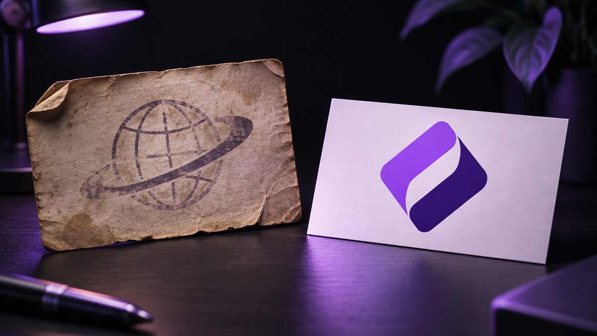
Many logos were never designed. They just happened: 20 years ago by a brother-in-law, on the printer's computer, from a clip-art collection. Back then it was fine. Today the logo sits in a tiny Instagram profile picture – and is barely recognisable.
Here are seven signs it's time for a rebrand.
1. Your logo doesn't work on a smartphone
Thin lines, long lettering, lots of detail: it looked fine on a sign. In a round Instagram profile picture or a tiny browser-tab icon, it's a smudge. Today a logo has to work small above all.
2. It looks like it's from another era
Gradients, drop shadows, 3D effects, clip art – old trends are instantly recognisable. Customers judge the business by its logo: if the logo looks old, the business looks old.
3. It no longer fits what you do
Started as a painter, now doing full renovations? Used to be pizza only, now a restaurant with delivery? When the logo tells a story that's no longer true, it confuses customers.
4. You look like the competition
The dentist with the tooth, the electrician with the lightning bolt, the barber with the scissors. If your logo shows the obvious, people mix you up.
5. There are no proper files
If every printer asks "Do you have the logo as a vector file?" and the answer is "no", you have a real problem. At the latest with a shop sign or vehicle, it gets expensive.
6. Every touchpoint looks different
Blue on the website, turquoise on the business card, a completely different icon on Instagram. Without a fixed identity your business looks inconsistent – and recognition never builds.
7. A new website is coming
The ideal moment. A new website with an old logo looks off. Done together, everything fits from the start. What a website costs: How much does a website cost in Germany in 2026?.
Rebranding without losing regulars
A new logo doesn't mean throwing everything out. Often a modernisation is the better route:
- The core idea stays, the execution gets cleaner.
- The familiar colour stays, but fresher.
- The name takes centre stage, the flourishes go.
That way regulars still recognise you – and new customers see a modern business.
When to leave it alone
Rebranding out of boredom rarely pays off. If your logo is clear, legible, available in every format and well known: keep it. Invest in your website or social media instead.
What it costs
At Ouceal a new logo costs €290, the complete branding package with colour palette, fonts, style guide and business cards €490. Full details: How much does a professional logo cost in Germany?.
Bottom line
A logo doesn't need to be new every year. But if it fails on a phone, looks dated or no longer fits you, it costs you customers – every day. More about our work: Branding & logo design.
Frequently asked questions
When should you change your logo?
When it looks dated, doesn't work on smartphones, no longer fits your services or doesn't set you apart from competitors. Changing a logo just out of boredom rarely pays off.
Will I lose regular customers with a new logo?
Rarely, if the rebrand is careful. Often a modernisation that keeps the colours, shape or core idea is enough. Regulars still recognise you, while new customers see a modern business.
What does a rebrand cost at Ouceal?
A new logo costs €290, the complete branding package with colours, fonts, style guide and business cards €490.
Should I renew my website and logo at the same time?
If both are due, yes. A new website with an old logo looks inconsistent, and vice versa. Done together, everything fits from the start.